Imagine this scenario.
You’ve buckled down and burnt the midnight oil to create a landing page that follows industry best practices and expert advice.
Yet, your landing page is not delivering the results you expect.
Instead of starting again from scratch, A/B testing can be an incredibly effective solution.
In this post, I’ll provide you a step-by-step framework on how to test landing pages to achieve your desired result.
Ready to find out how?
Let’s begin:
A Few Principles To Remember
As you read along, it’s important to be mindful of the following fundamental principles.
I – Define your metric for success
Landing pages should have one clear goal.
Whether it’s to collect emails, increase user signups, or drive sales, make sure to define your key performance indicator (KPI) from the start.
Otherwise, it becomes difficult to measure the success of your testing efforts.
II – Test both small and big changes
Most people focus on testing only small changes such as headline copy or image placement.
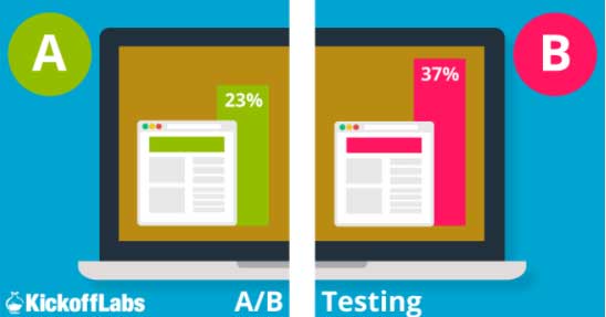
After all, it’s easier (and less risky) to to do. However, this often leads to negligible improvements.
Sometimes a big drastic change is needed to make an impact.
III – Don’t copy what others are testing
It’s easy to fall into the trap of trying to replicate successful tests from others in your niche.
Avoid this at all costs.
Your landing page is different, has a different target audience, business model, and offer. All these differences make it hard to reproduce the same results.
IV – Never run multiple tests at the same time
Running multiple tests concurrently muddles up results.
It becomes challenging to figure out which test actually led to the improvement you wanted. This is why you should always run one test before moving on to the next one.
With this in mind, you’re ready to begin designing your own test.
Step # 1 – Measure Landing Page Performance To Uncover Problematic Areas
Tests that provide exceptional results target deep-rooted issues on your landing page.
To uncover them, you need to engage in quantitative and qualitative research. Start off by looking at landing page specific data using Google Analytics.
You can find this under the Behavior > Landing Page section.
This should provide you with data points such as bounce rate, time spent on page, and form abandonment rate.
Here’s a glimpse of what the data looks like:

Relate this data back to your end-goal to determine where drop-offs occur.
For example, if you have a landing page with an opt-in form and the bounce rate is high, consider how to redesign this section.
Looking at the numbers can help you figure out where to focus, but the numbers won’t reveal causality.
To determine why your visitors are behaving in a certain manner, you need to talk to them and understand their intent and user experience.
Here’s how you can do it:
Option 1: Add an exit intent survey
Exit surveys “fly-in” when your visitors are about to leave the page.
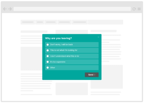
Use this opportunity to ask visitors why they are abandoning your page. This will help you hone in on what to redesign and test.
Ideally, you want to ask questions that reveal intent or points of friction.
For example, “What was the purpose of your visit?” or “Were you able to find the information you were looking for?” will provide you with actionable insight.
Make sure to use a combination of multiple choice and open-ended questions.
While multiple choice questions are easier to answer, open-ended questions allow free-flowing answers that provide the most insightful data.
You can create your own exit-intent surveys with free tools like Qualaroo and VWO.

Option 2: Implement feedback surveys
Similar to exit surveys, you can send a feedback survey (via email) to your existing customers.
The goal here is to understand what motivated them to convert or what prevented them from converting.
You can easily create a survey with SurveyMonkey or Google Forms.
Option 3: Perform usability testing
Unfortunately, not everyone will participate in your survey.
Moreover, surveys may not be accurate as there is no oversight to guarantee whether questions were answered honestly.
Usability testing reveals what visitors actually think of your page.
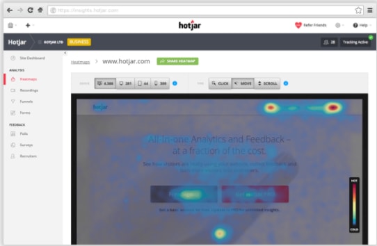
All you need to do is ask visitors to use a page and record their interaction.
You will be able to see exactly where they look, click, and where they experience confusion that prevents them from completing your goal.
HotJar and UserTesting are a few tools you can use to run these tests.
With problematic areas on your landing page identified, you’re now ready to brainstorm the sequence of testing you will implement to improve performance.
Step # 2 – Prioritize What To Test
Figuring out where to begin is often the hardest part of testing.
The amount of variation is nearly endless. Almost every element on your landing page can and should be tested in order to maximize results.
Here’s a small preview of tests that are essential for landing page optimization:
- CTA: Placement, Copy, Color, Size
- Copy: Headlines, Word Count, Value Proposition
- Forms: Length, Field Type (auto-selected vs. pre-filled vs. manual)
- Images: Placement, Relevance
- Pricing: Anchoring
Start off by creating a list of elements of you want to test.
Once you have readied a list, you need to prioritize testing order. This will help you figure out what to test first, second, third and so forth.
When prioritizing your list, it’s important to consider:
- How easy or difficult is it to deploy a certain test?
If a test will take months to design and execute, it’s probably not a great candidate for testing.
- What is the potential impact of your test?
Tests that seem to have more promising results are more desirable.
Next, assign a score to each item on your list. Give a low score to elements which you believe will give a small boost and high score to elements which you believe are the root cause of the problem.
Doing this for each test will help you avoid lackluster results. Remember that you don’t always need to test if the outcome is obvious.
For example, if you know your landing page has design flaws, save yourself time from testing small and ‘safe’ changes and go for a big win with a drastic overhaul.
This is exactly what Highrise did after several rounds of small tests failed to achieve their desired result.
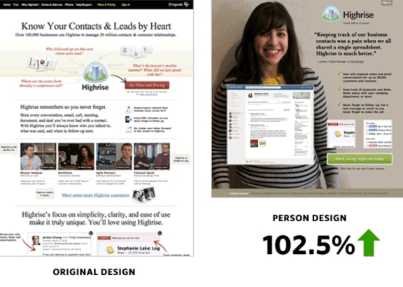
Big tests let you innovate and try out drastic changes.
Once satisfied, use small tests to refine and keep your page performing well.
You can find these ‘big wins’ hidden within customer feedback. Assess all answers carefully to find issues reported by the majority.
Step # 3 – Run Your Top Priority Test
With everything in place, you’re finally ready to start testing landing page variations.
This may seem challenging at first, but you don’t have to be an IT expert.
There are numerous tools you can use that let you create page variations through a visual ‘drag-and-drop’ approach.
Check out Unbounce or Optimizely:
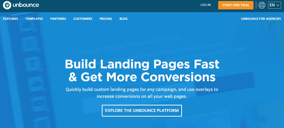
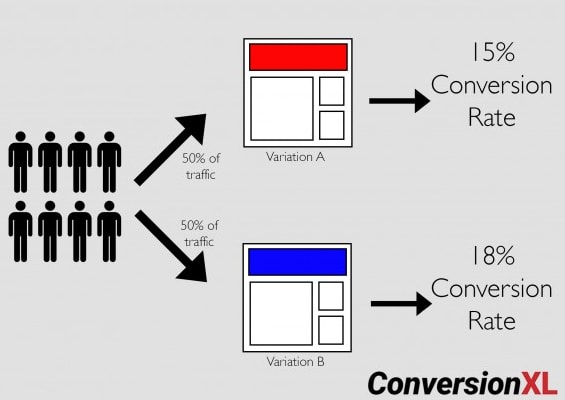
Make sure to divide traffic between your control (original page) and the challenger (revised page) equally.
For example, if you are testing between a red CTA and green CTA, divide traffic so that each page receives 50% of total visitors.
Selecting the appropriate length to run a test is critical to ensure the accuracy of results.
At the minimum, it’s recommended to run a test for at least 7 days. This reduces the likelihood of data being skewed by anomalies that occur on a certain day of the week.
To be even more accurate, check out this test length calculator.
After a test has run its course, you need to know how to interpret the results.
Results are always given with confidence intervals.
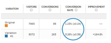
What do these numbers mean?
They represent the range in which you can confidently conclude performance of each page variation.
In the example above, the original page conversion rate is between 0.99% – 1.47% as compared to the variation which performed at 2.87% and 3.65%.
As there is no overlap between these values, it’s clear that the variation is the winner here.
Smaller confidence intervals are always preferable. Large intervals make it hard to trust whether results are actually due to your variation or a random sampling error.
If you’re not confident in your ability, you can outsource testing to a third-party who will manage everything from strategy to implementation.
Step # 4 – Rinse and Repeat
Testing is an ongoing process.
You may feel that your landing page has hit a ‘sweet spot’ and that you no longer need to test.
This is a risky game to play.
Landing pages can always do better and you should continuously test for improvements.
The status quo can quickly change and alter the performance of your page, leaving you unknowingly missing out on potential conversions.
After running a test, promote the winner to be a new control and test it against another variation.
Conclusion
You’ve worked hard to create a landing page.
The last thing you want is to have a page element block you from achieving your goals. Testing will help you visualize and eliminate these roadblocks.
Keep your eyes and ears open, put on your creative hat, and start testing today for success.
