Landing pages that convert are at the foundation of every successful business.
Yet, they largely remain misunderstood and poorly utilized.
There are countless blog posts focused on how to create a landing page that converts but most of them simply rehash the same strategies over and over again.
In this post, I’ll share a few uncommon landing page strategies that will take your conversions to the next level.
Let’s get right to it:
# 1 – Remove “Freeze Points” from Opt-in Forms
People don’t enjoy filling out forms, whether it’s at the grocery store or on your landinag page.
Forms are associated with an uncertainty that ‘freezes’ visitors, paralyzing from taking action.
Presenting a visitor with an opt-in form as soon as they arrive on your page can subconsciously lead them to delay their decision-making process.
Your goal is to eliminate this point of friction.
Here’s how you can do so:
Use two step opt-in forms
Two step forms require visitors to click a call-to-action (CTA) before being taken to your form.
Take a look at Hostanalytics’ landing page:
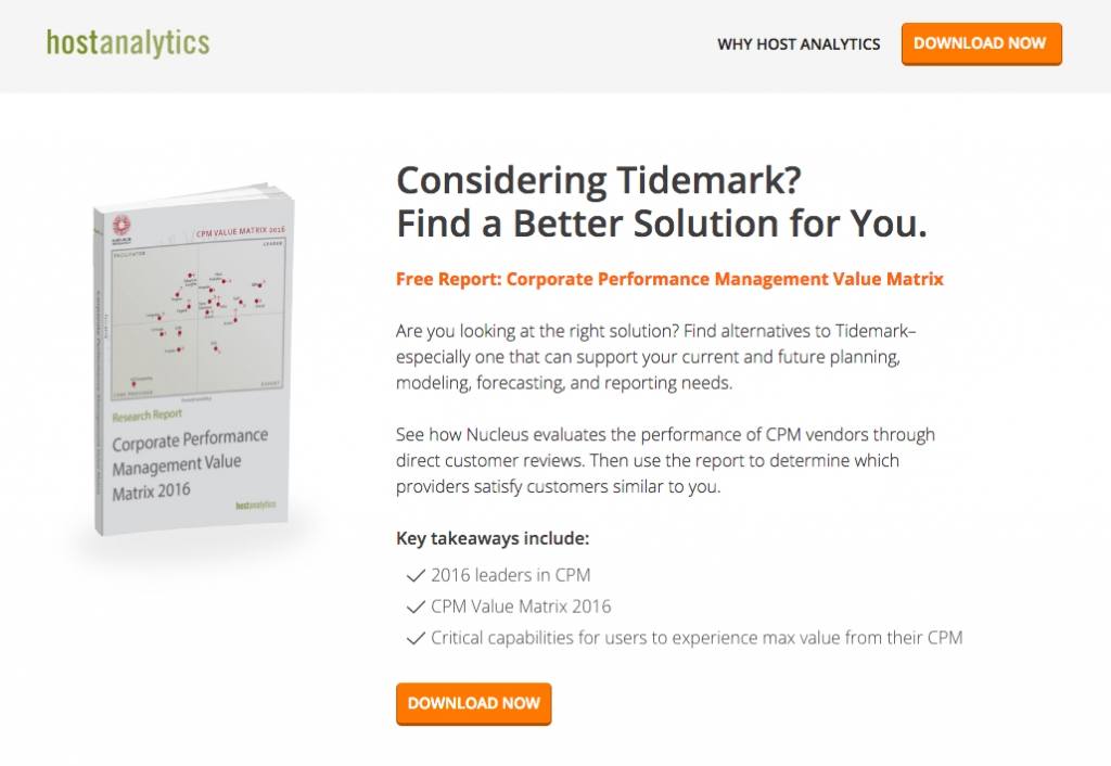
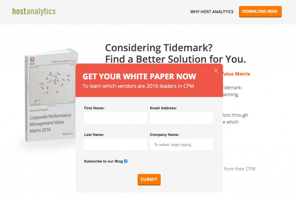
Visitors had to first agree to the offer and then click on ‘Download Now.’ Prior to that point, visitors wouldn’t have known that they would also have to fill out a form.
Why does this work?
People are more likely to complete an action once they have already clicked-through and subconsciously committed to it.
Auto-fill form fields
You can further reduce abandonment by pre-filling form fields.
If a visitor on your landing page has previously signed up for your service, auto-fill form fields with their information so that they don’t have to do so again.
Remember, visitors are doing you a favor.
Don’t frustrate them by asking for the same information repeatedly.
Plus, it’s far easier to entice a visitor to click one confirm button than it is to compete a number of fields.
Here’s a webinar registration page from KissMetrics:
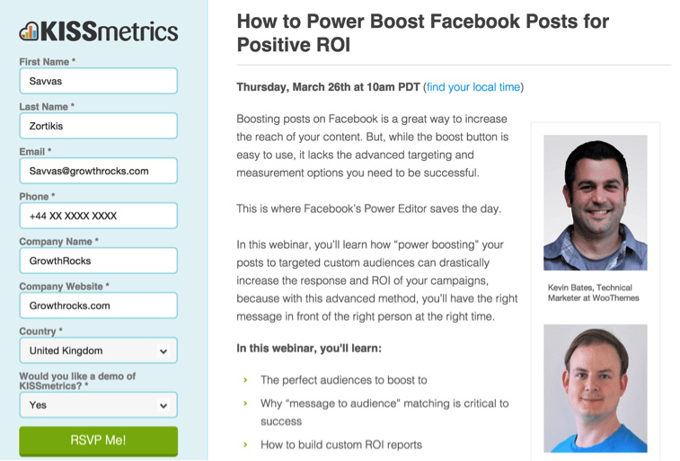
If this is a visitor’s first interaction with your brand, you’re unlikely to have any information about them.
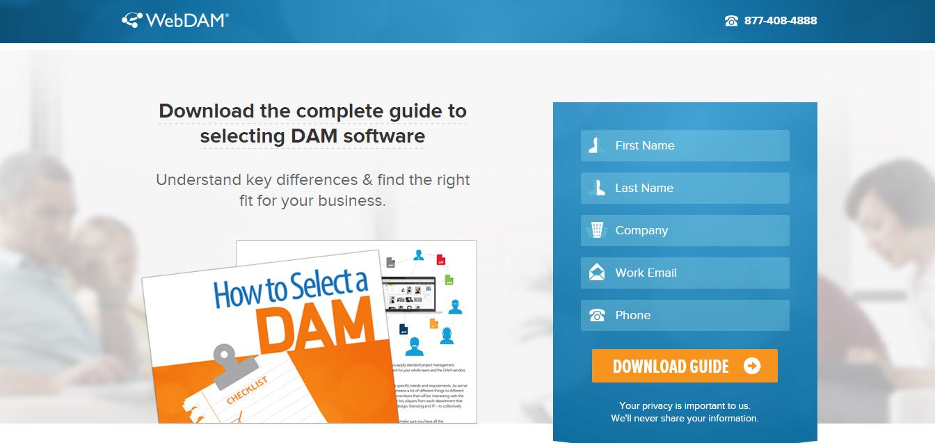
In this case, move the field label inside the actual field.
This visual trick makes the form seem easier to complete than a series of blank spaces.
This proved to be fruitful for WebDAM:
# 2 – Add a personal touch
It’s no secret that people prefer personalized experiences.
Personalized landing pages engage your visitors and make it seem as if your offer is exclusively tailored for their needs.
You don’t need to know a visitor’s entire personal history to personalize their experience.
Personalization can be as simple as customizing your landing page for:
Source of traffic
Knowing how visitors arrive at your landing page allows you to communicate in a format that better resonates with them.
For example, this campaign page from Obama specifically targets Redditors:
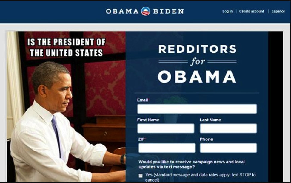
The meme styled image here acts as an homage to Reddit. It’s sure to satisfy Redditors and convince them to hand over their information.
You can also use dynamic text replacement (DTR) on your landing pages.
DTR lets you adopt your landing page copy to match the exact intent of your visitors. This further increases relevancy of your page.
In this post about personalizing your landing pages, live chat purveyor The Chat Shop included a great example of how Hootsuite uses DTR effectively:

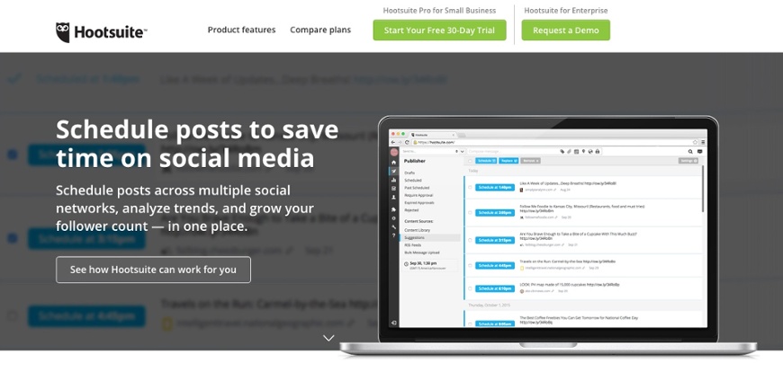

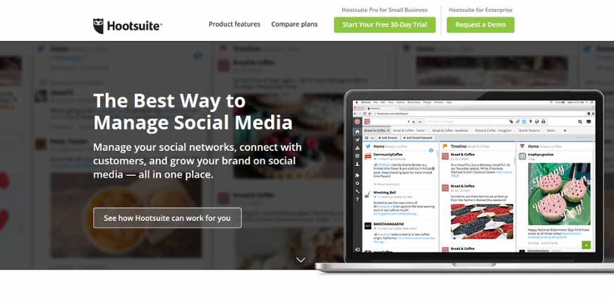
The headline and sub-headline on the same landing page adjust accordingly to what the user has typed into Google search.
Physical location of your visitors
Geo-targeted landing pages let you provide locally relevant offers.
Notice how Hertz’s landing page for Singapore is different from its Chilean counterpart:
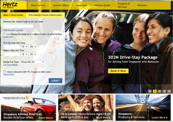
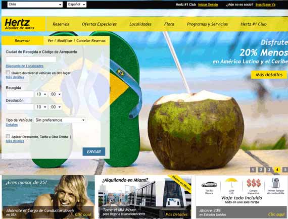
This lets you connect with a country’s demographic and culture to further increase the relevance of your landing page.
Another great way to personalize your pages is to make them interactive.
Invite your visitors to interact with your page through quizzes or assessments that reveal valuable information.
LeadDoubler’s landing page is an interactive calculator:
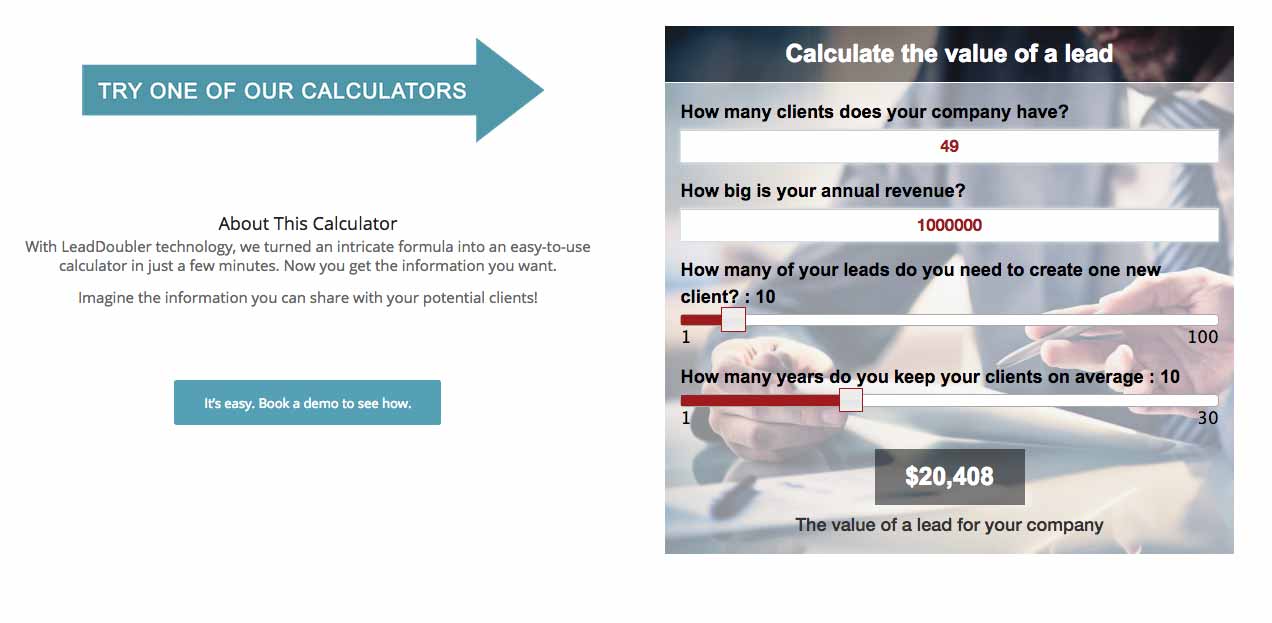
Effectively, visitors are buying into your offer indirectly.
Visitors will remain interested in your offer in anticipation of the results.
When you finally do release them, visitors will already be emotionally invested in your brand and are likely to continue their relationship with you.
Still not convinced on personalization?
Beyond capturing visitor attention, personalized landing pages reduce bounce rate.
This positively impacts your SEO and increases engagement, leading to more conversions.
# 3 – Use long-form pages (with multiple CTAs)
Conventional wisdom states that landing pages should be short and sweet.
This only holds true if your offer is straightforward, low-cost, or if you’re already well-established and trusted by site visitors.
Otherwise, a short landing page isn’t always going to cut it.
If you’re relatively unknown or have an expensive offer, visitors are going to be far more scrupulous with their decision.
A long-form landing page allows you to be more persuasive.
Frank Kern integrates long-form landing pages to give a ton of details to those considering signing on to his program.
He uses a lot of words without obvious CTAs, which establishes trust but could reduce visitor retention and conversion.
Copyblogger’s copywriting course offer effectively integrates multiple CTAs.
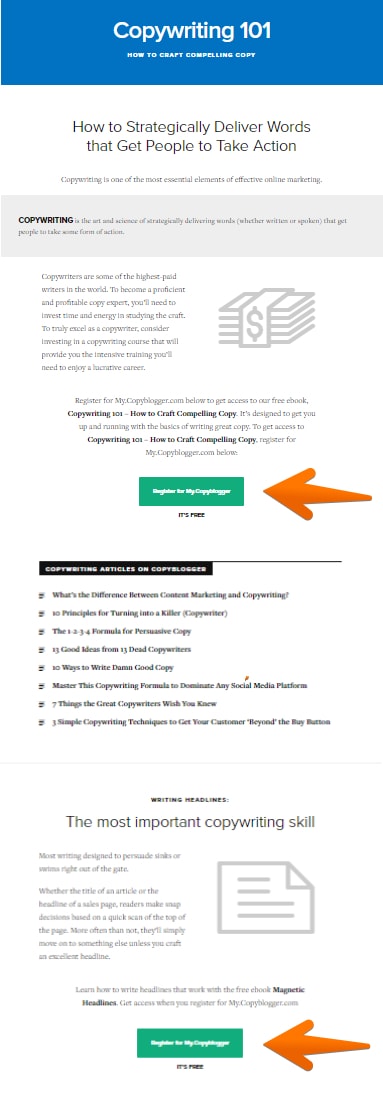
Make sure that each CTA asks visitors to take the same action.
Ideally, you should place a CTA after each persuasive section, where the likelihood of conversion is the greatest.
# 4 – Mind your manners and say thanks
When it comes to landing pages, conversions are the ultimate goal.
This is why there’s an abundance of resources online that provide insight on how to increase landing page conversion rate (just like this post).
What’s often forgotten is how your business needs to act after a conversion takes place.
If you provide no further instruction on what happens next, your freshly minted customers may feel cheated and regret their choice.
So what should you do?
Guide customers to a thank you page. These pages are an extension of your landing page experience.
Wistia’s thank you page is simple but effective:
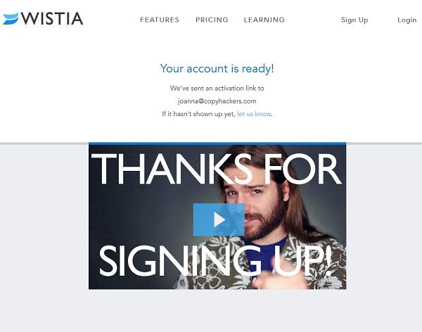
Besides just saying thank you, they inform customers what to expect next.
This is your opportunity to provide additional information that you think a customer may find helpful. It’s also a great chance to upsell.
The Lead Pages Thank You page, is an example of doing this exceptionally well:
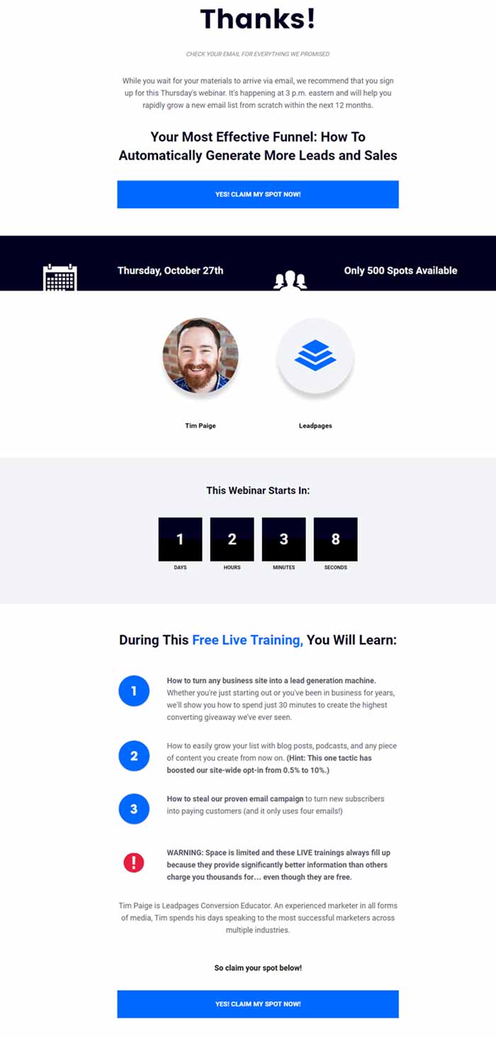
LeadPages is killing two birds with one stone.
They thank their new customers and then proceed to upsell their webinar. This makes the most of an engaged customer that already has their wallet open.
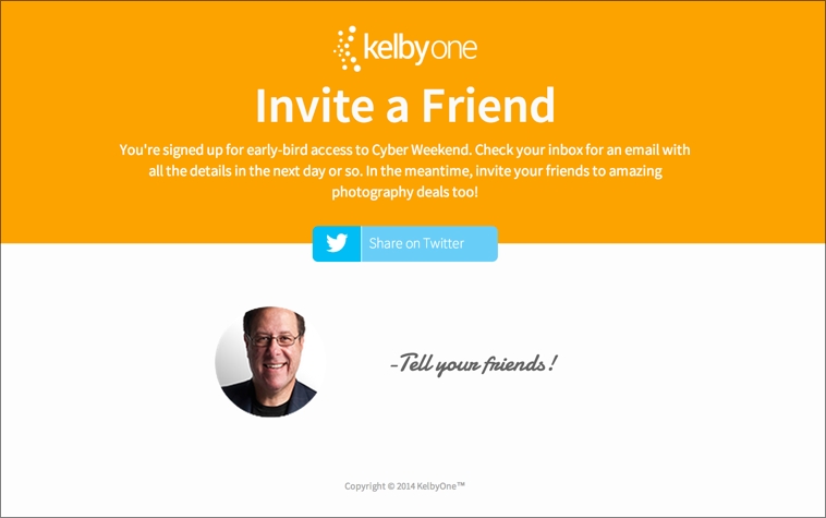
Alternatively, you can request customers to take a specific action such as sharing your service with their family and friends.
Kelbyone does this with their landing page:
# 5 – Establish Legitimacy
Being trustworthy and credible are critical factors for conversion.
Without reassurances that you’re a real business, visitors will hesitate to take action on your offer no matter how compelling it may be.
This is why social proof and trust symbols are commonplace on most landing pages.
A much quicker (and easier) way to build trust is by displaying your contact information or physical address directly on your landing page.
American Bullion does this with great effect:

Another option is to add live chat support.
It’s difficult for visitors to get a complete understanding of your offer from a landing page.
A live chat feature allows you to provide immediate answers exactly at the point of hesitation when visitors might otherwise back out.
Human interaction resolves their query while giving your staff the opportunity to highlight your brand’s personality.
Fotozap’s landing page features a persistent chat box:

Conclusion
These 5 unorthodox landing page strategies will help turn your ho-hum landing page into a conversion machine, engaging and captivating your visitors.
As with anything, remember to A/B test each approach to see what works for your brand and your customer.
It’s time to take it up a notch and kick your landing pages into high-gear.
